
Overview
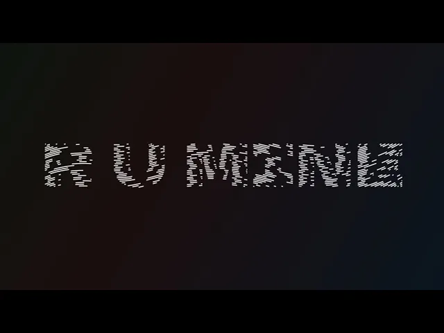
A high-energy kinetic typography exploration of the Arctic Monkeys’ track "R U Mine?", designed to translate raw rock energy into a sophisticated motion experience. The project involved a full 3-minute sequence that merges Swiss design principles with rhythmic, data-driven motion.
Insight
Inspired by the minimalist AM album cover, I realized that the song's "Indie and Stoner Rock" vibe required a balance between stark, high-contrast aesthetics and fluid motion. My goal was to prove that typography alone can communicate the "tone of voice" and "exuberance" of a performance without the need for supporting imagery.
Challenges
The primary difficulty was maintaining a clean, Swiss-driven minimalism while introducing enough colour to create visual variety across a long duration. Additionally, the project required extreme technical precision to synchronize complex JavaScript-driven effects with the singer's exact timing and vocal inflection
My Solution
I utilized high-impact typefaces like TT Travels Next and Helvetica, paired with a subtle pastel palette that added depth while keeping the design modern. Every keyframe was carefully eased to reflect emotive content, using literal motions, such as the word "String" physically hanging, to reinforce the narrative meaning of the lyrics
Takeaway
This project sharpened my ability to manage large-scale motion workflows and solidified my understanding of how motion principles can add significant emotive value to text. It demonstrated that I can take a rigid, classic design style and push it into a dynamic, contemporary motion format.
For the best viewing experience, set the video quality to the highest available resolution.

" height="163.00000105626776px" id="dCKhojRds" width="742.9999783139957px"/></svg>)